The Rundown
The Recommendation
The Rating
The Links
The Reviewer
Katie Rose Guest Pryal
Visit Katie Rose Guest Pryal‘s website.One of the questions I get asked a lot by new authors, and even experienced authors, is how they should design their websites.
The first thing I tell people is this: Your website is a very personal thing. It is your personal representation on the internet. Thus: your website is a high-stakes representation of you.
At the same time, it is a living creation that you have to maintain and nurture over time. In order to maintain it, it must be simple enough that you can maintain it, most likely by yourself unless you have money to burn on a web consultant. Even if you can afford a web consultant, learning to maintain your own website is very empowering. It can also mean that you can keep your website up-to-date and accurate faster.
Your website is thus a delicate balance: a high stakes representation of you, but one that is constantly evolving. For this reason, if you’re not careful, your website will suck a lot of your time. Planning well at the beginning will head off a lot of that time-suck later. Let’s work through some of the questions that you should consider as you plan your website design or redesign.
Multiple Websites?
Many authors often wonder whether to have multiple websites, especially if an author is already full-time freelancer in some other capacity. My advice, almost always, is that you should have a single website. The reason is simple: You are your brand. Your brand is not your book, or your editing services, or your consulting work, or your hand-made books, or your photography, or anything else that you do for love or money.
(Sidebar: If you have trouble thinking of your writing self as a “brand,” you might need to go back to the beginning of this series of columns and start reading. Of COURSE you are a brand. Readers buy books from authors they like. From authors they think are neat-o. They want to know about your life, about your favorite jeans, about your fedora collection, about your pets, about how your spouse can’t sort the utensils properly, about who you are as a person. Because you are you. You are your brand.)
Thus, reason #1 to have a single website is to give a full picture of your brand.
Reason #2 to have a single website is to make it easier for you to make money. It’s a given that (most) authors have multiple income streams. We do other work for money. Some of us teach, some edit, some coach, some tutor, some do website design, some illustrate books and design covers, some are lawyers who help negotiate author contracts. I have heard so many different work descriptions in the time that I’ve been coaching. Authors are such creative people. We need websites that encompass the fullness of our creativity—and make it easy for clients to hire us. A reader may come to our website for our books, but that reader may be an aspiring author as well. If she loves your books, she’ll hire you as an editor or writing coach. She might love your books, and that love will bleed over into a love of your art or photography.
What do DON’T want to do is make it difficult for you to make money. And sending people to multiple websites is difficult for them. They have to click more links. They have to learn a new website with new navigation. They have to figure out how the new website relates to the old website. Don’t make your readers do that. Keep all of your work in one place online.
Reason #3 to have a single website is simple practicality: You do not want the hassle of maintaining three separate websites—or of writing three separate blogs. (And trust me, writing blog posts is the best way to drive traffic to your website.) It’s hard enough to post once or twice a week. Posting that much on two or three blogs? No way.
So what does a single website look like in action? You’re welcome to take a look at mine, but let’s use my friend’s as an example. I recently consulted on her website redesign, and the website came out great.
An Example: The Artist-Novelist
My friend is an artist, a writing consultant, a workshop leader and teacher, and a novelist. She told me that she needed help designing a website for her forthcoming novel series. She already had a thriving business with her work as an artist and had taught artist workshops around the country. She sells her work in her online store and it hangs in museums and galleries. Her artist website also has a blog about her art and about her burgeoning writing career.
When she asked me what to do about her website, I told her she had three choices: (1) Create a new website for her novelist identity that would be separate from her artist identity. (2) Create a new website for just her novel series. (3) Expand her existing website to encompass her novelist identity. Guess which one I suggested she do. That’s right. #3.
(Sidebar: Many new authors choose #2—the book-centered website. Unless you only plan on writing one book, this is a terrible idea. And even then, I don’t recommend it. The book isn’t the product. YOU are the product. And what happens when you publish your second book, and your third? You created a whole website for a single book, a website that has become irrelevant.)
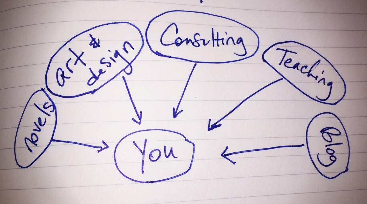
First I asked her a question: “Do you want to keep up with writing two blogs?” She made an appalled face. I explained to her how posting to your blog drives traffic to your website, and how spreading that traffic across two websites might be counterproductive. Then we got out a piece of paper and drew a sketch. I asked her, “Tell me all of the things you do. All of them.” And I drew this:


